Context
Estimating work shouldn't feel like work
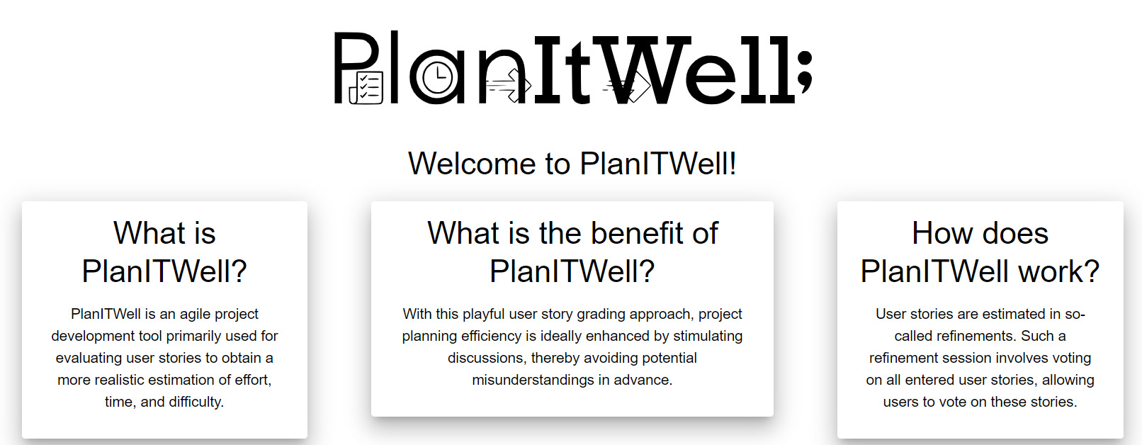
In Scrum, teams estimate every user story before they commit to it. Everyone votes with story points at the same time, the votes are revealed together, and the team talks through the gaps. This ritual is called planning poker. At DCCS it happens in refinements, and until now the teams used a free online tool for it.
That tool did the basics, but it got in the way. DCCS asked our diploma team to build a replacement that fit how their teams actually work. PlanItWell started as a school project in 4th grade. It became our diploma thesis and now runs on the DCCS intranet.
Loading stalls
Loading problems in the old tool slowed down the voting itself, which is the one moment that has to feel instant.
Hard to navigate
UI/UX issues made it hard for people to find their way around the app.
Manual copy-paste
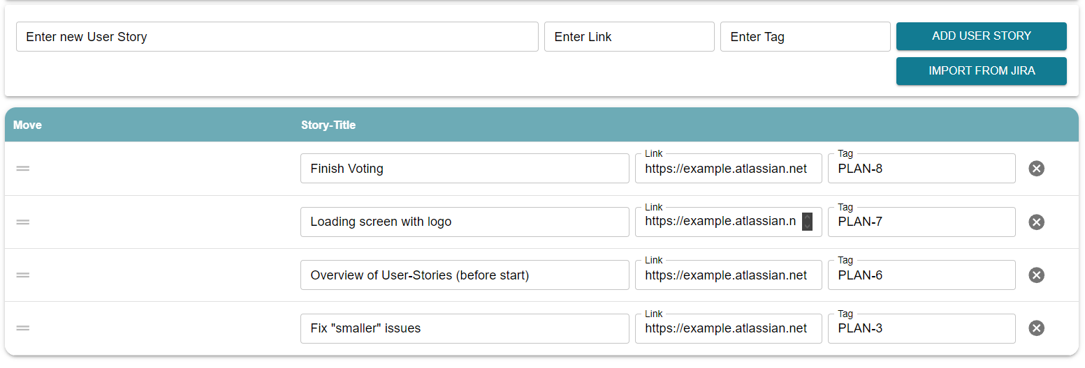
There was no Jira integration, so moderators typed every story in by hand before a session.
My role
One designer, four developers
The team elected me head of UI/UX in 4th grade, before PlanItWell had a single screen. My job was to find out, through online research and real-life testing, how the app could be as usable as possible for the people in the room, and what that meant for development.
“He actually designed the whole project all by himself.”From the team-structure chapter of our diploma thesis
What I did
- Paper wireframes of the first screens, then every page in Figma
- Usability tests with the team; fed the findings back into the designs
- Worked with the frontend developers who built the designs in React + MUI, and wrote parts of the frontend myself (e.g. multi-language support)
- Wrote the thesis chapter on what makes a good UI, plus the chapters on Scrum and our sprints
Process
From paper to production in eleven sprints
Explore the old tool
Sprint 1: we studied the existing planning-poker app and noted what slowed teams down.
Paper wireframes
Rough sketches of text fields, buttons and page flows helped us agree on what we were actually building. Every feedback round went straight back into the sketches.
Move to Figma
Figma let me design more complex pages than paper ever could. By the end of the school year, a single story could be voted on end to end.
Four weeks at DCCS
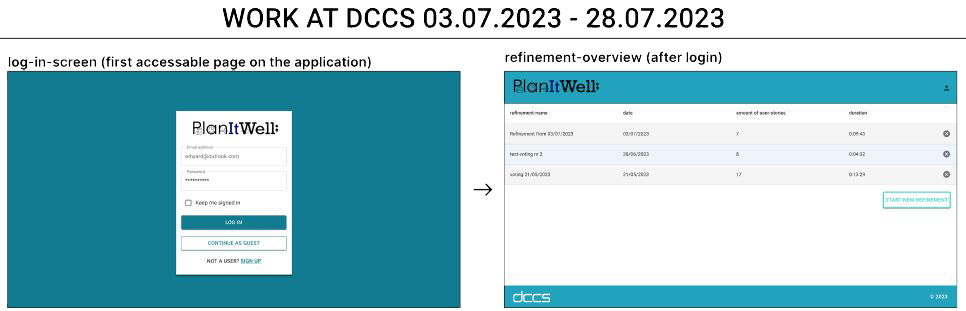
One-week sprints, viewings with the DCCS team (10, 19 & 26 July) and a real refinement run in PlanItWell on 13 July. The design system as it exists today went in during this month.
UI & UX milestone
Dark and light mode, German and English, and first accessibility work.
Refine the cards
Sprint 11: a revision of the UI and the card design, plus a long list of frontend fixes.
Thesis submitted
Written in English, including my research chapter on UI quality and usability testing.
Research → practice
Four principles, and where they show up
For my part of the thesis I researched what makes a UI good. Four principles kept coming up, and each one became something concrete in the product.
Consistency
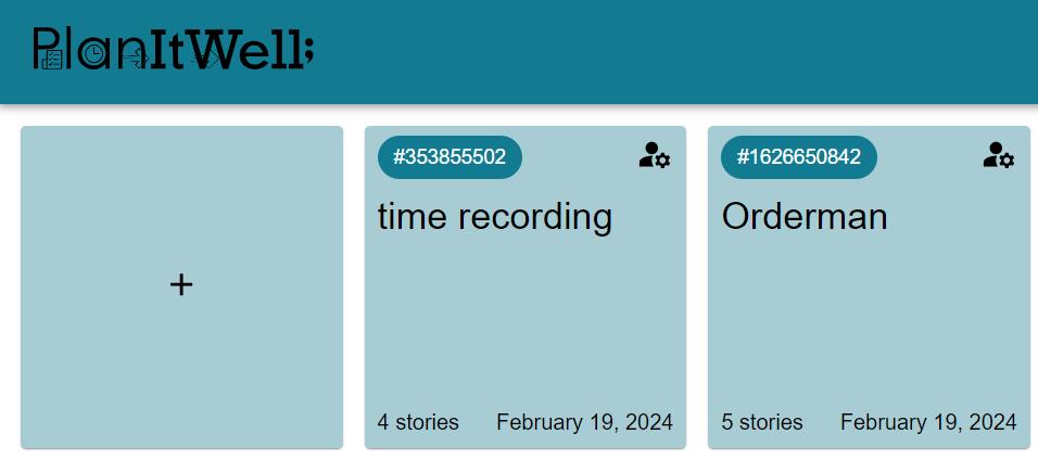
One header and footer on every page, one teal palette, one type style. Changing fonts and colours from page to page wears users out over time, so none of our pages do it.
Simple navigation
Two anchors that never move: the logo in the top left always takes you back to your refinements, and the profile in the top right holds everything that isn't about voting (theme, language, account).
Informative feedback
Hints and errors appear right under the field you're typing in, e.g. what a valid password needs. Snackbars at the top of the screen explain what went wrong instead of sending you to an error page.
Prevent errors early
Buttons stay disabled until an action makes sense. You can't start a refinement while stories are missing descriptions. A warning appears before the last story, so nobody ends a session by accident.
Key design decisions
Make it feel like a game night
A card table, not a form
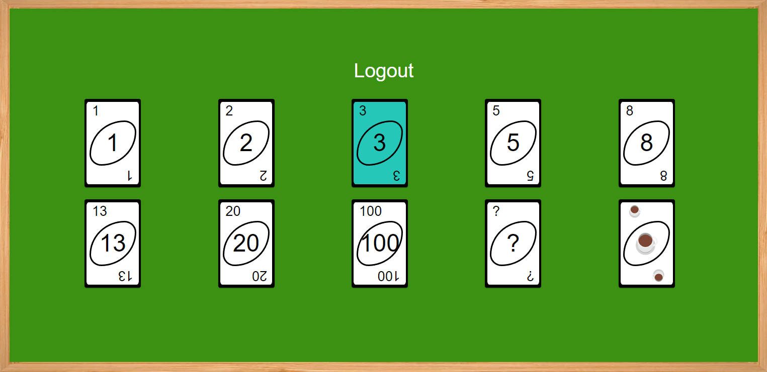
Voting happens on a green felt table in a wooden frame. The story-point cards borrow the look of UNO: corner numbers, a tilted oval and one bold figure. It makes a dry ritual playful, and it's obvious what to do without instructions.
Two phases, one table
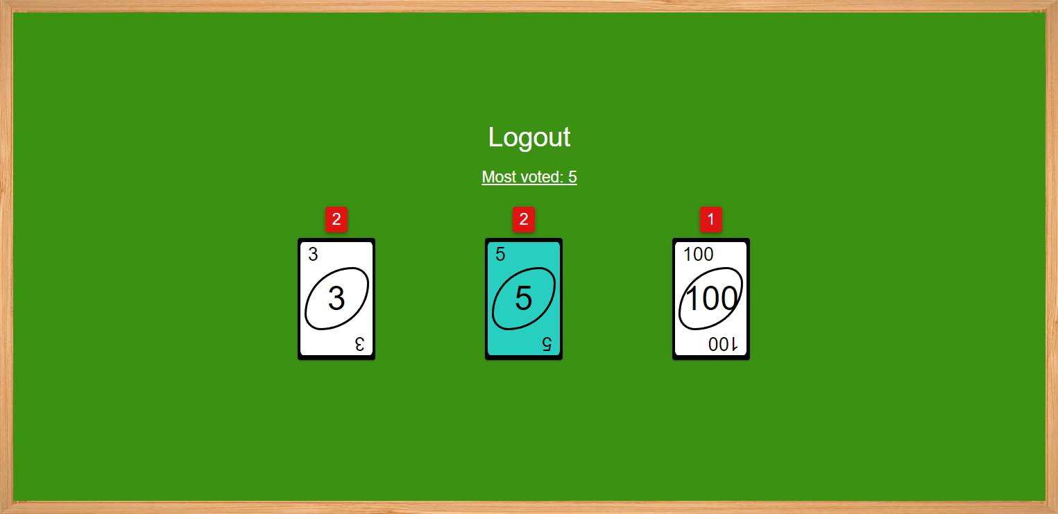
While voting, you see the whole deck and your pick lights up in cyan. At the reveal, only the cards someone played remain, each with a red badge showing how many votes it got and the “most voted” value above them.
Roles you can see
DCCS wanted three roles: Moderator, User and Observer. Each has its own icon in the participant list, so everyone knows who sets the final number and whose vote counts.
Built for mixed teams
DCCS has offices in several countries, so the app is available in German and English (Spanish came later). You can switch between a light and a dark theme, named “Sunshine” and “Dracula”, and your choice is remembered.
The product
Screens
By the numbers
The project in figures
- 11sprints: 4 weeks long at school, 1 week at DCCS
- 50user stories across those sprints
- 1,116 hlogged by the whole team
- 3user roles in a refinement
- 2themes: Sunshine & Dracula
- 3languages: DE, EN, ES
Reflection
What I learned
Pretty isn't the same as usable
Some of my early designs looked good but made the app harder to use. I learned to trade my favourite ideas for simpler solutions that both the developers and the end users could accept.
Test once there's something to test
Usability testing only paid off once a clickable prototype existed. Before that, feedback on sketches stayed too abstract. Watching people use the app told me more than asking them about it.
Tools have limits
Figma made team collaboration easy, but I had to learn it by doing, and working around its canvas sizing cost me time.
Process should match the time you have
With only a few hours per week during school, Scrum's ceremonies ate time we could have spent building. During the full-time internship at DCCS, the same process worked really well.
Credits
The team
- Jonas SuppanschitzUI/UX design, usability research
- Sebastian SchachnerProject lead, full-stack, WebSocket/STOMP
- Benjamin KoglerBackend (Spring), deployment (Docker)
- Melanie VolstubenFrontend and design implementation, Jira, colour research
- Tobias OrtnerFrontend business logic
Supervised by Dipl.-Ing. Gernot Loibner, BSc, at HTBLA Kaindorf an der Sulm (Computer Science), with DCCS GmbH as our industry partner.